


self.reflect() Week 8 – QuickSet the App and The Adventures of Agency Week
This week was our second to last week of instruction. It was a challenge because for the first time we worked on a major project individually to push ourselves to see what we could get done in 4 days.
The Iron Yard Design class in Austin Texas, (shout out!! Great job everyone!) designed several iPhone app user interfaces. We were responsible for choosing which we wanted to do and set out to do as much of it as we could. The designs came with several questions as some had problems that needed solving and we had to consult with our instructor who played the client roll. Most of his advice involved saying like, “That sound great, do that!” or “I have no idea what do you think?”. So I had a lot of freedom to make the project work in they way I thought it should.
What was the project?
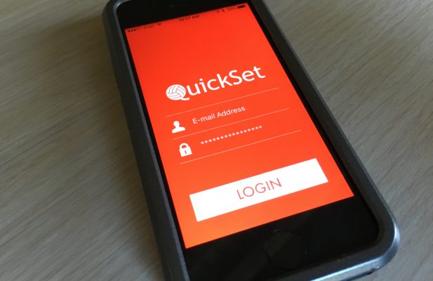
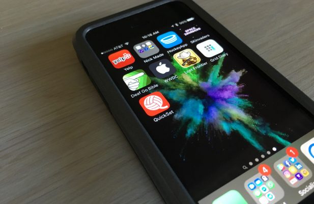
The project I chose was a volleyball app. It didn’t have a name, so I gave it the name “QuickSet”. The term means, “a set (usually 2’ above the net) in which the hitter is approaching the setter, and may even be in the air, before the setter delivers the ball. This type of set requires precise timing between the setter and hitter.” The fact that my project involved connecting people at the proper time to insure the league went well for all teams and coaches made this a perfect fit for the app name.
Established fact that a reader will be distracted by the readable content of a page when lookingt its layout. The point of using Lorem Ipsum is that it has a more-or-less normal distribution of letters. I then went into looking at the UI design and noticed issues with some of the things displayed and how the UX was for the user. You can see the concept given by the Austin TIY campus on the right.
The first thing I noticed was when I went into the app that I clicked on notifications at the bottom, but when I hit menu I was taken to a screen I was surprised to see. I assumed I would see what I saw again. So I asked my client if I could add a side menu where the main view would slide to the right enough to give context but display the menu well. The second thing I saw that was a concern was that on the home page there was no icon for rank. The #3 was used twice. So I added an icon to it. The last thing I noticed, which I didn’t get time to complete was the standings. I didn’t understand the bars and was going to change that to reflect more percent stats for each team. For example I wanted to total each teams spikes and assists and compare each team to the league to show who carries the most percentage as a team in the league for assists or spikes.
In the end, I got the UI where I liked it but didn’t fully complete it, though I know I could. My teacher pushed me to move from UI and focus on challenging myself. So I set out to add Firebase (a dynamically changing non-relational database) to handle each user and their information.


I was able to get a login screen, have it remember the user the next time they opened the app, and finally I was able to log out the user. Firebase made this easy but I was excited to add a login which is usually difficult for myself. I ran out of time adding the rest of the data and my instructor gave me some hints at the end that had me in a better direction. This was a great project and I learned a ton about what I can do and what I need to work on. I liked the design given and enjoyed implementing it into Swift as well as learning to find problems and adjust the design to meet the needs of the client.
Comments (0)